
Mirror.
Mirror is a concept project of responsive E-commerce for a trendy clothing company for the whole family. It is made to give customers omnichannel experience in modern world.
Role : UX Designer
Client : Mirror Clothing Company
Tools : Figma, PSD, AI, Google Sheet, Google Docs
Project Timeline : 80 hours

If time is limited, check out the 1 minute summary below.
BACKGROUND
Introduction
Mirror started back in 1994 as a clothing store targeting a budget-minded audience who looked for low-cost clothing for both kids and adults for formal and informal styles. They have over 400 stores around the world in 32 countries.
Problems
Mirror has a very outdated logo that they are looking to re-do
Mirror is very successful offline but no online platform
Mirror has plenty of remaining inventory in their warehouses that are very difficult to move if there are only a few pieces left, for which online selling would be a solution
Project Goals
Make modern logo which make Mirror competes better with improved image
Create attractive online platform - a website to sell and connect with customers
Clean the inventory with different kind of advertisement online
Create a successful responsive clothing website which provides smooth user experience anytime and anywhere.
Outcomes: learnings.
It is my first case study of UX design, I was learning necessary steps and how to tackle the problem with exploring various possibilities while using the strength I have from my background.
The market is quite broad so it is not difficult to find participants, however, designing the website with colour combination and feel was challenging because the market is huge and it is difficult to make it stand out but not too basic while fitting every category.
I learned so many things from research, time management, approaching and contacting new people, it was a good learning curve to get a valuable feedback. The areas I need to work on are trying to be more patient and not too ambitious because learning new things can be overwhelming and it takes time to digest and be good at it.
Do you want to read the full story ? Keep scrolling, 10 minutes read.
Let’s do this!

Preview of Features

Problem: Mirror has no online website while they are doing great offline for brick and mortar stores.
Solution: A responsive website is created in order for Mirror to have strong presence in online sphere.

Problem: Mirror has no website with online shopping feature to boost their business apart from their physical stores.
Solution: A responsive website with online shopping feature is created so users are able to shop conveniently from anywhere.

Problem: Users find that it is difficult to know if the clothes they choose online will fit them by look and size.
Solution: Virtual Fitting feature is added on the website to help user with this problem.

Problem: Users find that it is convenient to have saved wishlist and they can revisit the list to order them.
Solution: Sign up and sign in page is created so they have profile to save information, wishlist, sizes and preference in the system.
List of Contents.
1. Research
2. Define
5. Reflections
3. Ideate
4. Prototype
1. RESEARCH
It was an essential step to understand the trend and market for Mirror. Here are some of my key insights from my secondary research:

“Competitive analysis was conducted to understand the market and know how to compete in online fashion sphere. These brands were chosen based on similarities of target market and they have strong online presence.”

Direct Competitors
Target, Shein and H&M are direct competitors for Mirror due to the similarity of the target market

Indirect Competitors
ASOS and Amazon are indirect competitors for Mirror due to their strength in online sphere with similar market
Domain Research Findings.
Fashion e-commerce industry is very competitive & aggressive.
It is challenging to customise Mirror website design because target market is broad.
Brands are very innovative and creative with their marketing.
Filtering and sorting products are also essential part.
Various important aspects to offer digitally, eg.clean picture, material information, easy delivery and returns.
Important to build trust and make customer loyal to the brand.
“Brick and mortar shopping has decreased tremendously in the past few years and e-commerce is growing faster than ever, however, does industry really understand what are customers' demands and expectations? I resonated with this project to dig deeper on what is the effective way to approach the market and building successful UX for e-commerce.”
1. EMPATHIZE
It was an essential step which includes research and immerse experience on users' perspective. I chose User Interviews for this project because I wanted to develop a deep understanding of the users such as their goals and pain points in online shopping experience. It was an important part to compete in the market. Together with knowing what competitors do for their customers, I can properly plan the best strategy for Mirror.
User Research Plan
I prepared few important points for my main goals, objectives, methodologies, questions, participants, assumptions/risks, and timeline. I planned this user research plan with an open mind and the enthusiasm to understand the answers of the questions and how to find the best solution for both stakeholder and users.
User Interview
I conducted Interview to understand more in depth of how people feel and think when they are doing clothing online shopping. I was able to conduct a successful interview with this interview guide involving 4 participants from 25-35 years old, with 1 male and 3 females. I get useful insights of uncovering their motivations, wants and needs for clothing online shopping. I wrote down the outlines in my Empathy Research Findings of all important details.
Research Debrief
I summarised the whole information of findings from participants to prioritise the problems and possible solutions of the research.
Key points that the participants brought up during the interviews:
-

Naomi
“Online shopping is really convenient because it is available 24/7 and I don’t like to queue to the cashier and fitting room.”
-

Rick
“It is difficult to see the quality, fitting and the sizing.”
-

Vinny
“It will be nice to have real live online shopping so I can get the benefit from both worlds.”
Key Takeaways
Top Need
To create a successful responsive clothing website which provides smooth user experience anytime and anywhere.
Pain Points.
Sizes are not consistent and difficult to imagine the fitting on their body
Participants were frustrated with slow and paid shipping and returns
Too cluttered layout with so many things on a page is overwhelming
The pictures provided usually look different than the products delivered
Difficult to know the quality just solely based on pictures
Sometimes they don’t know how to style the clothing
It is difficult to decide to purchase if there is no review on product
Difficult to envision the clothing on themselves
Motivations.
Easy shopping online anytime anywhere
Effective filter that eliminates the hassle and time waste for user
Available promotions anytime to boost their shopping motivation
Wide range of product groups and sizes to reach bigger market
Fast and easy payment
Express delivery option
Hassle free returns
Helpful sizing feature
2. DEFINE
I defined MIRROR’s potential user market as those who are already familiar with the brand and shop offline and new user who like to shop online but not familiar with Mirror. How might I help shoppers shop online on Mirror's website at ease?
Persona.
Chloe is one of the created personas who represents the market. She is a professional who works in a big city, interested in fashion but doesn’t want to spend so much on clothing. She enjoys the convenience in buying clothing online.


Project Goals.
Reliable brand
Easy check out & payment
Browse and purchase from any device
Satisfying online shopping experience
Simultaneous online & offline stock detail information
Ease navigation & search
Have fast & responsive website
Sale items to clear old inventory
3. IDEATE
How do I solve the problem? What’s the right thing to build? I started IDEATE step with gathering all research findings and making a hypothesis.
Persona Storyboard.
As a working professional in a big city, Chloe uses her phone often for various reasons including shopping online, social media and paying the bills. Due to the busy traffics, she doesn’t like the hassle to buy clothes in-store because she finds it troublesome. While buying clothes online has another disadvantages, especially about the sizing, how it fits and also paid shipping and returns. She finds it frustrating because she likes to look trendy but she doesn’t like to exhaust herself browsing for hours. She is also not a big fan complicated filtering. She is conscious of her spending so pay later option is a huge priority. Given these points, the smooth and affordable shopping experience is something she is craving for.

“I imagine the flow to find a product from clothing website and what options and possibilities are available. I was inspired by checking direct competitors sites such as ASOS, Shein and H&M..”
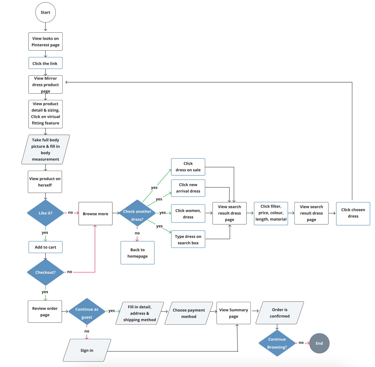
User Flow.
This user flow is based on Chloe experience in finding a dress:
Chloe needs a dress for the important date. She wants semi casual dress to impress the guy. She gets some inspiration from Pinterest and refers her to Mirror website.
Rebranding The Logo.
01. Sketches
I made some sketches based on the research I did. It is family friendly yet modern but simple and fun at the same time. It has dynamic and represents the brand in competitive market. I did survey to have clarity which one is the most attractive design.

02. Logo & Style Tile
Based on the brand value and direction, orange colour was chosen as the core colour. It has been strengthen by feedbacks I received. It guided mr in the right direction to receive best possible result.

03. UI Design System
UI Design Kit was built to have some standard and make the website uniform and consistent.

“Orange is associated with meanings of joy, warmth, enthusiasm, creativity, encouragement, fun, expression and fascination...”
Sketches & Wireframes
Firstly I created hand-sketches then created mid-fidelity wireframes for the Homepage, Category Page, Product Details Page, Virtual Page and Checkout Pages. Mid fidelity wireframes were created with focusing on the best flow and most ideal user experience based on the research, demand and feedback from users. I also get some insight by examining several fashion websites.


Wireframes Details
Homepage
I created homepage wireframe while remembering what is the goal and what are important points based on the research previously. So I want to keep it simple with all important features but also easy to navigate. The hero page will change between sale to clean the old stock but still trendy with current event of the brand.

Homepage Content
While for homepage content, I want user to have easy access to what is trending, category with icons to make it clear yet give diversity on the page. The idea for joining Mirror member is to build relationship with customers and give some perks as part of Mirror family. The bottom part mentioned the latest feature of Virtual Fitting which gives extra comfort when people purchasing clothing online.

Category Page
For this page, I placed the filter on the left side with list of product groups, radio button for colour and checkbox for the length, the reason is because it has less click an user can check products with all filtering in one page instead of filter with drop down on top. The total product on top right is to inform how many products are in this category and I keep one page with total of 4 rows for fast load. The colour option under thumbnail is also to make easy decision before clicking more for product page.

Product Page
For product page, keeping it simple but informative with providing pictures from different angles and close up, also with video for movement. I understand that the reviews are important so I placed it on top that clickable to review page but I placed summary of reviews below pictures for quick look. Product description with size and fit are available next to picture. I made the sizing option visible together with availability to reduce cognitive load. I also placed similar item option and complete the look section at the bottom to help customer with alternative and easy styling.

Virtual Fitting Page
This page is essential in improving the comfort of shopping online. The idea is new but I want to show that, it is not that complicated to fill the form and show user how it works.

Shopping Bag Page
This page is important for the brand because it should be as simple as possible to guide user to the payment page. I created information box on top for eligible shipping, summary of chosen products with pictures for convenience purpose and stated there are available payment options. I give flexibility to delete or add them to wishlist. Next, to remind user if they want to be a member for free shipping, otherwise they can also add items from wishlist.

Payment Page
This last page before making a purchase, I made it very simple and straightforward so no other page to open. The idea is with drop down option and user can see how many step they need to do clearly. The grey box shown as inactive and will be active once the previous step is filled in properly. Place order button will be activated and turns black once everything is nicely filled in.

UI Screens.

4. PROTOTYPE & TEST
How should I build it? Prototype was prepared for usability test. I wanted to see what goes well and which part needs to be improved.
Test Objectives.
Define whether users think it is easy to navigate the menu and find products. Is the navigation easy to use and understand?
Define about what users think of the overall design of the website. Is that attractive and engaging them to shop?
To identify any potential pain points for users and why.
Define whether the check out and payment process are smooth and clear.
To determine the Virtual Try On is helpful, easy to use and boost users’ confidence to purchase products online.
Define potential aspects for users to purchase more and loyal to MIRROR
User Testing.
I tried to recruit wide range of participants within Mirror's market to bring various insights into my design iterations. I have recruited 6 participants, whom align with my provisional persona form both genders. They were different participants than my research phase because I want to gain more insights from different perspectives. I also received extra feedback from group crits at Designlab. I chose combination of in-person moderated test and remote moderated testing for Usability Tasting.
Affinity Map.
As a result, based on quotes from the users, I have collected the following User Testing Findings and broke it down as an Affinity Map:

Iterations.
01. Homepage

02. Product Page

03. Virtual Fitting Page

04. Shopping Bag Page

05. Sign Up Page

5. KEY TAKEAWAYS
MIRROR has taught me various valuable insights in understanding what is important for users based on their needs. Design Thinking method helped me greatly to break down and follow the process of research and building the most effective UX e-commerce website for MIRROR.
Ask “WHY” before sketching and designing
Practicing design thinking is essential in building a website
Design systematically - Learning how to design systematically was also part of my growing path in this project.
Performing usability test is essential for a successful website to be not biassed with our own subjective assumption
Different voices matter - Empathise people based on their experiences and feedback is a huge part in understanding what works and what are pain points of online shopping process.
Next Steps.
Create Screens for tablet and mobile devices
Plan more quantitative & qualitative research
Plan another Usability Test